.jpeg.9b05f1872bc0b8a203a1819d515e114e.jpeg)
Benjamin Grimm
-
Posts
43,349 -
Joined
-
Last visited
-
Days Won
22
Content Type
Profiles
News
New York Mets Videos
2026 New York Mets Top Prospects Ranking
New York Mets Free Agent & Trade Rumors, Notes, & Tidbits
Guides & Resources
The New York Mets Players Project
2026 New York Mets Draft Tracker: Picks & Bonuses
Forums
Blogs
Events
Store
Downloads
Gallery
Everything posted by Benjamin Grimm
-
I'm thinking Rusty Staub.
-
Maybe the Mets need to get a new calf guy.
-
-
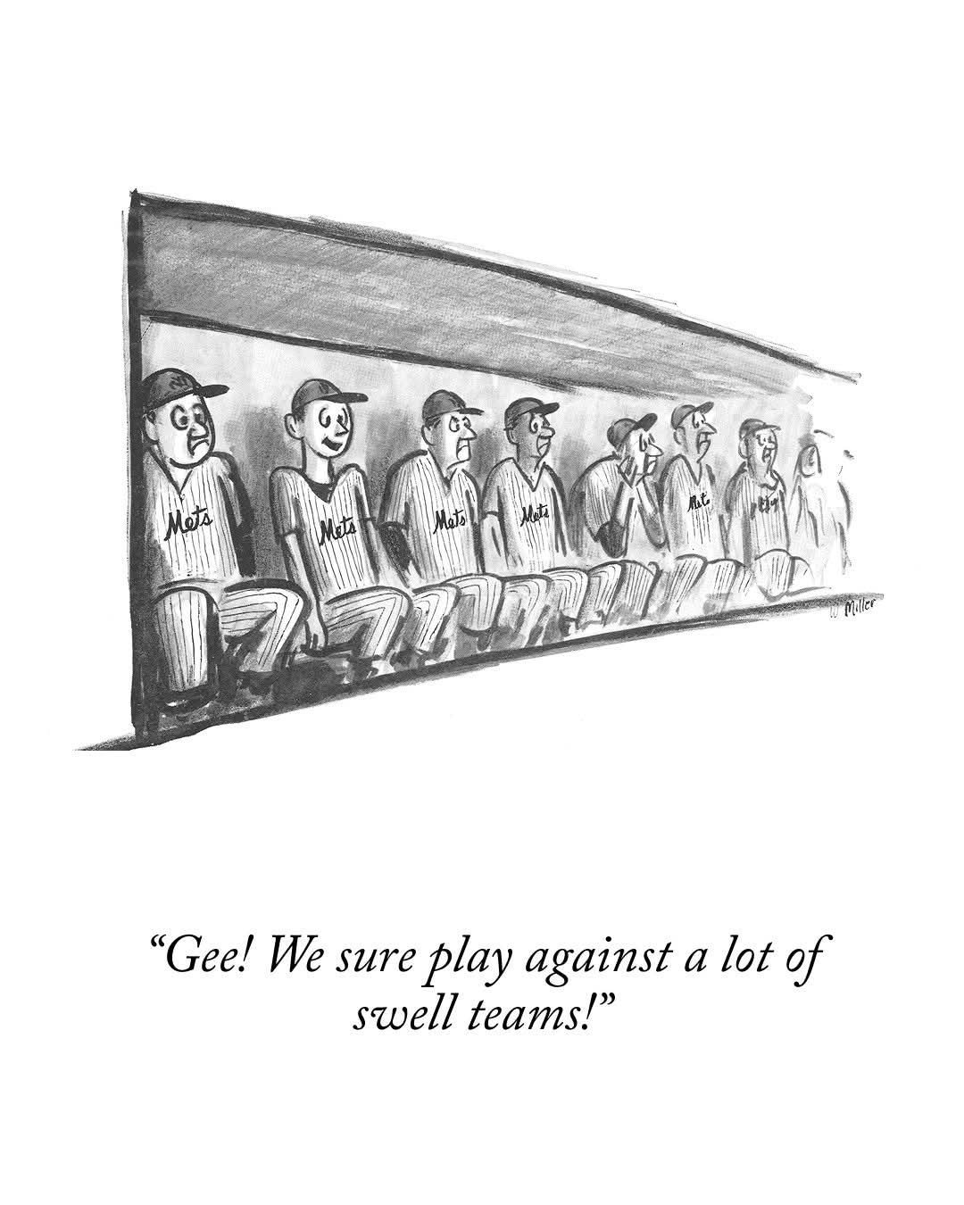
The Mets paid a potentially steep price for Peralta. I expect that if they trade him they'll want more than a mid-level AA prospect.
-
I agree. But to seawolf's point, I think Lindor, Soto, and McLean are all very unlikely to go. But yeah, Holmes, Bichette, Peralta, Robert, Semien would all be available. As would Senga and Peterson and Williams if anyone wants them. Younger guys like Baty, Vientos, Alvarez, and Benge aren't really "fire sale" types, but who knows? One or more of them might be used to sweeten a deal that takes on a less desirable player, like Semien perhaps.
-
.thumb.jpeg.1a5b323fe15e9824ad40cee6189bd6d0.jpeg)
Question of the week: are you optimistic?
Benjamin Grimm replied to Brock Beauchamp's topic in New York Mets Talk
I'd love to know what Steve Cohen is really thinking. -
Question of the week: are you optimistic?
Benjamin Grimm replied to Brock Beauchamp's topic in New York Mets Talk
-
Question of the week: are you optimistic?
Benjamin Grimm replied to Brock Beauchamp's topic in New York Mets Talk
That's true. When people say "there's still time" it doesn't mean that April games don't matter as much as September games do. It means that there's time to put together a hot streak that will negate this awful streak. -
Question of the week: are you optimistic?
Benjamin Grimm replied to Brock Beauchamp's topic in New York Mets Talk
I had to vote no. Of course they'll get better than this, but it looks like the season is going to be a long slog that will end in late September. -
I know what you mean. Despite the jokes about "rooting for laundry" a fan's interest relies on a sense of continuity from season to season. There are always changes, and the team evolves from Tom Seaver to Lee Mazzilli to Darryl Strawberry to Bobby Bonilla to Mike Piazza to David Wright to Jacob deGrom etc. But sudden wholesale changes definitely lead to a feeling of disconnect. Especially since some of the more prominent players this year are likely to be short-term transients, like Robert and Polanco. And likely Peralta and Bichette as well. We could focus on the younger players with many years as Mets ahead of them (McLean, Alvarez, Benge, Baty, Vientos) but some of them are likely to go for the next one-year veteran rental.
-
Yeah, I noticed that too. And I agree.
-
Here's the vote of confidence...
-
Well, if any one player is going to turn things around, Juan Soto is the type of guy who can do it. But what we really need is for Soto to come back strong and for Lindor and Bichette to start producing and for a few other players to step up as well.
-
This really looks bad.
-
I just turned on the game, and when I saw the Cubs' uniform I thought the Mets were playing the Montreal Expos.
-
I asked Alexa who was pitching for the Mets today, and she told me it was Bartolo Colon. Somehow, I doubt that's true.
-
I'm pretty confident that Lindor and Bichette are going to hit. And that Soto will too. I'm much less confident about Semien, Polanco, and Robert. That's too many question marks. Stearns looked very smart when he rebuilt the roster on the fly during the 2024 season. I think that's the last time he's looked particularly smart.
-
A year ago I would have been saying John Gibbons. I suppose Beltran has a shot. I have no idea who would be a good choice.
-
I don't think anyone here expected that this trade would turn out to be a good one.
-
I have no idea what's going on over there.
-
Mets Roster Central 2026 at Grand Central
Benjamin Grimm replied to Edgy MD's topic in New York Mets Talk
Or some baby food. -
I realized it was Jackie Robinson Day when I went to Baseball Reference this morning and all of the photos on the home page were of players who had played in the Negro Leagues.
-
It's called fashion, sweetie, look it up
Benjamin Grimm replied to A Boy Named Seo's topic in New York Mets Talk
The first time I saw that photo used in a meme, the girl in the foreground represented Andres Gimenez and the girlfriend represented Amed Rosario. I guess that would have had to have been in 2020. -
I noticed that Mets hitters no longer seem to be swatting away armpit odor after they reach base on a hit. This makes me wonder if it was a thing promoted by one of the prominent recent departures. Nimmo? McNeil? Alonso? Which of them was a crusader against armpit odor?
-
It's called fashion, sweetie, look it up
Benjamin Grimm replied to A Boy Named Seo's topic in New York Mets Talk
I agree. The Braves jersey should have peaches. The Pirates jersey should have steel. Or three rivers. The Reds jersey should have, um, uh, Les Nessman?
.thumb.jpeg.1a5b323fe15e9824ad40cee6189bd6d0.jpeg)